Bloom and Grow, matching dies Budding Blooms

I really enjoy coloring, so using the blends is very relaxing to me. How about for you? This card in particular was pretty simple & easy to do. What makes a difference in a card are the details. For instance, did you notice the coloring on the background? That was done oh so casually with both light and dark Stampin Blends. It’s a bit too straight for my liking but for today we’re going with it.

Here are the details:

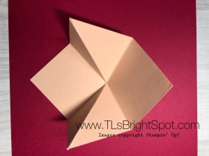
  • Very Vanilla card base cut to 4 1/4″ x 11″ and scored at 5 1/2″ – opens from the left
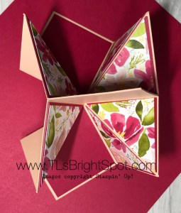
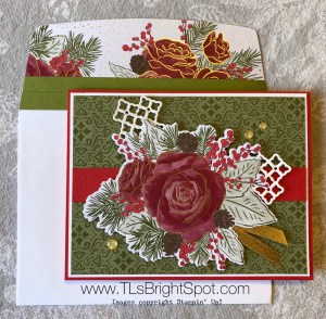
  • Poppy Parade layer 4 7/8″ x 3 5/8″, put on card with dimesionals
  • Shimmer card layer 4 3/4″ x 3 3/8″: use Stampin blends Petal Pink to color, alternating light and dark. Adhere Shimmer paper to the Poppy Parade layer with liquid glue.
  • Stamp the flower in Memento black ink; color flowers with Poppy Parade blends light and dark; color leaves with Call Me Clover blends light and dark; color berries with light Poppy Parade; cut out with appropriate die and adhere with dimentionals onto the Shimmer paper.
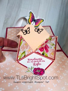
  • Stamp the sentiment on a scrap of Basic Black cs with Versamark ink. (Use the embossing buddy first to clear the cs of static) Dip into white embossing powder, flicking off excess, and heat emboss. Adhere to card fron with dimensionals.
  • YAY! Front is done…

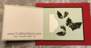
Inside… I wanted to keep this really simple so stamped one of the flower bouquet on the bottom right side in Memento black ink.

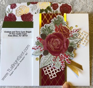
Envelope… Again, wanted it to be simple but eye-catching so dry embossed a 6″ x 2 1/4″ Poppy Parade with the Coastal Weave 3D embossing folder. This was adhered with liquid glue and cut to fit.

This card could so easily be done in most any shade using the Stampin Blends. Whatever color you use for the flower, coordinate the underlying paper and the envelope flap. YAY! Can’t wait to see what you do with this stamp set.

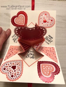
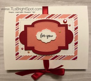
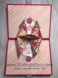
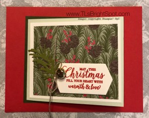
OK, after writing this post, I just had to share the rest of the cards I created. I had a class Monday night and did some extra stamping to share how to move the light and dark blends. Here are several:


Enjoy creating, crafting, sharing. Please use my HOST CODE 2TMMA9HX if your order is over $50 and I will send you a free $10 .item of your choice. One freebie per customer per month, thank you!

Bloom and Grow with coordinating Budding Blooms dies

Oh my goodness… I think I have shared with you how much I enjoy coloring. If not, well now you know 😏 The weather here was gray, overcast and rainy – a bit on the dreary side to say the least. Hubby was home and wanted a fire in the fireplace so I brought my crafty stuff to that cozy spot and had a “jolly good” time.

The night before I had taught a class and demonstrated coloring with blends. I had stamped and cut some extra pieces so I could demo a different color than what we were making in class. I only did one the night of the class and this set was calling me to do more. With this delightful, cozy setting of the fireplace ablaze, our Springer Spaniel lying close to the fire and my hubby reading, I couldn’t resist staying close by.

Here are the cards… card 1 is the one created in class. The others are what I completed yesterday afternoon. n

Blends used varied with each card… the first is Poppy Parade and coordinating blends with Petal Pink both light and dark blends for the back ground; and Call Me Clover light and dark for the leaves, Poppy Parade dark for the berries. The next card shows Granny Apple Green light & dark blends for the back ground, Petal Pink light & dark for the flowers, Mint Macaron light & dark blends for the leaves, and light Flirty Flamingo for the berries. The next card was kept very simple – no card stock background and I love it! Highland Heather light & dark blends for the flowers, Granny Apple Green light & dark blends for the leaves, dark Flirty Flamingo for the berries and Soft Seafoam light and dark blends for the back ground. Card four: light Poppy Parade + dark Petal Pink for the flowers, Granny Apple Green light & dark blends for the leaves, soft Seafoam light and dark blends for the background and oh yes, dark Poppy Parade for the berries. Last but not least: the yellow card is affixed to Daffodil Delight card stock but is colored using both light and dark Mango Melody blends, Old Olive light and dark for the leaves and dark Flirty Flamingo for the berries, Mint Macaron light and dark blends for the back ground. Whew – a whole lot of fun!

Remember when using the blends, it’s better to start with the darker shade first and only do a small area then sweep in with the lighter blend to do what – blend together. 😁 The reason for doing small areas is to keep the blend moist so it easily “moves” for the blending process.

I hope you enjoyed todays post. Would you share with me which card you like the most… I’m leaning toward the Highland Heather but I also really like the yellow card. I also liked putting the card stock on an angle as opposed to straight on. Do you have thoughts on that?

When you shop with me and your purchase is over $50, please use my CURRENT HOST CODE – 2TMMA9HX to receive a free gift from me.

May you have a beautiful day – share what you love!


Happy Birthday To You!

What fun it is to have birthdays! Just last week I celebrated a BIG ONE… but hey, it’s only numbers 😉 So today’s card is not a birthday, but an anniversary card using the Happy Birthday To You stamp set. Pretty cool, right? Gotcha!

Here’s the card…

Coloring is so relaxing for me. Have I said that before? Here it’s Petal Pink light and dark blends for the flowers and Mint Macaron light and dark blends for the leaves. I have found it helpful to do the dark first, just a small area at a time, then do the light to blend it in nicely.

The cake was stamped with Versamark ink and heat embossed with Silver Embossing powder. I used the Smokey Slate blend to shade some of lines on the cake for emphasis. The cake stand was colored with the Petal Pink blends also. After cutting out with the matching Birthday dies I put dimensionals on the back and set it aside.

The Smokey Slate card stock piece was cut with the Stitched So Sweetly dies. I put dimensionals on the back of it as well.

Silver thread is a messy business for me – it’s thin and light and slippery as the dickens. However, I have learned to control it just a bit  by wrapping it around my fingers, first a couple of times around two fingers then a couple of times around three fingers, then cut, twist and adhere to the back of the cake with glue dots. I did that twice. Adhere cake and Silver thread to the Smokey Slate piece.

The next layer is Petal Pink (2 1/2″ x 5 1/4″) that has been dry embossed with the Parisian Flourish 3D Embossing Folder. Pretty cool isn’t it? Remember to spritz it lightly with water prior to sending it through the die cutting/ embossing machine. This gives wonderfully deep impressions. Adhere the Petal Pink to a Thick Whisper White card base (4 1/4″ x 11″). Attach the Smokey Slate and you’re almost done with the front. The key here is the Rhinestone Basic Jewels – they add the crowing touch!

The inside…  Stamp the sentiment of choice on a scrap of Whisper White. Here I used the happy from Happy Birthday To You stamp set and the anniversary from the Well Said stamp set. They were stamped in Versamark ink then heat embossed with Silver Embossing powder. I used the Stitched Rectangle dies to cut both a Whisper White and a Smokey Slate piece and adhered with liquid glue to a Whisper White (4″ x 5 1/4″). This was adhered with liquid glue to a Petal Pink (4 1/8″ x 5 3/8″) and all adhered to the card base with liquid glue. Inside… done!

Now for the envelope.. First I stamped the sentiment from Happy Birthday To You in Smokey Slate. Next I dry emboseed a 2 1/4″ x 6″ Smokey Slate with the Parisian Flourish #D embossing folder and adhered that with liquid glue, did a neat trim and voila!

Heart Pop Up Card Revised

Some time ago I posted a picture of this fun pop up card and promised to give directions… never did that! Ugh, ugh and ugh… My apologies and thank you for your patience – or maybe you were ready to unscrew my head. Glad you didn’t do that, thank you very much. Here’s the card from then and a look at the inside as well.


And here’s the card I just created today:

  • Card base is 5 1/2″ x 8 1/2″,scored at 4 1/4″.
  • Prepare the card front first!
    • Adhere 20-22″ ribbon with tear n tape in the center of the card. I find it helps to mark the center of the card with pencil , to keep it straight. This ribbon is retired – so sorry but I liked the shiny look!
    • The DSP is cut at 4 1/4″ x 3″ and adhered with liquid glue. The DSP is from the 6 x 6 pack Dressed to Impress.
    • The next three layers are from the Stitched So Sweetly dies. The second and third layers are adhered together, then added to the card with dimensionals. The top layer with the sentiment (from So Sentimental ) is also on dimensionals. The tiny beads are From My Heart Faceted Gems and available right now.


Now do the inside:

  • Cut 2 pieces at 4″ square: score vertically @ 2″, then horizontally at 2″, then diagonally once. Burnish all fold lines. It should look like this:


  • Cut 2 pieces of 1 3/4″ squares in Whisper White. These are your sentiment pieces.
  • Cut 6 pieces of a contrasting color at 1 7/8″ square,  then cut 4 of those squares on the diagonal
  • Cut 4 pieces of Designer Series paper at 1 3/4″ and cut diagonally. Adhere to the solid triangles created in the previous step.
  • At this point I suggest paper clipping the 4″ squares together that create the center. Do this PRIOR to adhering anything to those 4″ squares. This will make it clear what gets glued together where. It should look like this:

  • Layer 1 7/8″ card stock on the square sections first; followed by the diagonally cut DSP in the folded area. It should look like this once those papers are adhered with liquid glue.
  • Stamp your sentiments on the Whisper White squares and adhere to the 1 7/8″ appropriate squares.
  • Adhere those paper clipped areas together with liquid glue, fold both sections closed, making certain they are well burnished. It should look like this.

  • Cut contrasting DSP at 4″ x 5 1/4″ and adhere to both inside areas.
  • Adhere the card insert on one side only, in the center of the card, near the fold. Again, making a pencil mark to locate the center will keep this pop up in the right place.
  • Use liquid glue on the remaining section and close the card to adhere the panel. This works really well and allows the card to open fully.
  • Decorate your center. Here I used the butterfly from Positive Thoughts (Mini Catalogue), colored with both the light and dark Lovely Lipstick blends and Daffodil Delight blends for the edge of the butterfly. It was cut with the matching dies called Nature’s Thoughts. I cut two small butterflies using Black Foil Sheets with the same dies. Each of these were adhered with liquid glue.i added one small black Faceted Dot to the large butterfly.
  • At this point I simply looked at the nearly completed card and felt something more was needed. Dressed To Impress and matching dies called All Dressed Up came to the rescue. The small flower is just plain cute and easily goes with this Best Dressed 6 x 6 DSP. I colored the flower with light and dark Lovely Lipstick blends and the leaves with light Old Olive blends. The center of the flower was colored with light Daffodil Delight blends.
  • Now the card is complete and I love the finished look. Just think of all the fun ideas you could do with this card.. bees, balloons, birthday cake, shoes, perfume, lipstick – oh my  gosh, the list goes on and on! Have fun creating – would love to see what you do with this.

When you order supplies, remember to use my

current HOST CODE -2TMMA9HX

If your order is $50 or over, you will receive

a free item of your choice not to exceed $10.

One item per customer/ month thank you.


Lovely Lily Pad – New from the Mini Catalogue

Oh boy! Impressionistic style is not really my “thing” but this paper and the Lily Pad dies absolutely brought this alive for me. Take a peek.

The base of the card is Lovely Lipstick, followed by this fabulous DSP called Lily Impressions from the new Mini Catalogue (available Jan 3, 2020). This card was prepared in an eclipse style, allowing the use of those wonderful variations in the colors of the paper. I actually used two of the dies, the larger cut exactly where the flower is placed and a second smaller die cut from similar colors. This smaller die cuts an outline of all the petals and I took each of those flower petals and put them on a very small dimensional, cut down to size. I adhered the outline shape to the larger diecut, just at the bottom, allowing the upper portion of the smaller die to be free. Then those small petals were fit inside the appropriate place. The sentiment from Dressed to Impress (also from the new Mini Catalogue available Jan 3, 2020) was stamped on the larger lily pads of the Lily Pad dies. Bermuda Bay cardstock and ink were used for the sentiment. Peaceful Poppies sequins were adhered to the lily pad. Yep – you guessed it – they are from tghe new Mini Catalogue available Jan 3, 2020.

and here’s the inside:

Bermuda Bay and Very Vanilla cardstock were used for the inside. The lily from Lovely Lily Pad was stamped in a two step method, by simply turning the stamp over. This is a new type of stamp introduced in the Holiday catalogue. Each side of the stamp is flat; one side has the detail of the stamp and the other side is the filler. It is suggested to stamp the detail side first. It is so easy!

Thanks for stopping by. If you do not have a SU! demonstrator and are interested in ordering or desire a current catalogue or the new Mini Catalogue, please contact me soon! My order for catalogues will be arriving any day now and I will be mailing them right away. Waste no time in making the connection.

Placing an order is easy peasy – use my HOST CODE (UEGTXS7Z – good until Dec 21) if your order is between $50-$150 to receive an item of your choice valued at $10 or less. Be sure I have your address when letting me know what your desired item is :o)

Wrapped in Plaid, Pine Tree Punch

Today I tackled a spinner card and it was such FUN to do. Yes, a bit tricky, but after doing a Pinterest search for a video, I figured it out. One thing to remember is whatever you want to spin, it mustg be a reversible image. There are some things I have to learn about this new computer too, like how to load my own video onto this site… And this card with the spinning tree is cute! Until I learn how to do that – still shots of the card are what I have.

The base of the card is Cherry Cobbler. Additional card stock used is Whisper White, Shaded Spruce, Wrapped in Plaid Specialty DSP. Other supplies include: Pine Tree Punch (a carry over item to 2020 BTW!), and 2 3/8″ Stitched circle die, clear thread, Tear ‘n Tape, Tombow glue and Toile Tidings Glitter enamel dots, and finally Glimmer dots from the Christmastime Is Here Suite.

Christmastime Is Here!

Hello Readers! Sending Christmas cards has been one of those responsibilities that was once a chore… Why is it not a chore now? I make all my own cards of course and what is fun is to lay them all out on the table (they are all different as mass producing is just not my thing). Next I review my list of folks to whom we send cards. I write each name on little sticky notes and then comes the fun – who gets each card? It brings a smile to my face as rarely when I’m making Christmas cards do I think of who is to receive it. Putting those little sticky notes on each card is like a little prayer of thanks for that individual or family. I have to share part of my pile of sticky notes once the cards were addressed – ‘cuz I didn’t think of it until late that this might be a fun thing to share.

Isn’t that a fun pile?

Today’s cards are favorites (well, recent favorites). They are both made with the Christmastime Is Here Suite of products.

The first card is landscape style and begins with a card base of Poppy Parade followed by a layer of Whisper White then the DSP and a strip of Poppy Parade. On top of this is the flower diecut from another piece of the DSP. Isn’t that beautiful? Under it is a different diecut that I simply cut into two pieces to place where I wanted them. The ribbon and additional embellishments are also from the suite. The last thing I did was use Wink of Stella on the flower. Wherever there was a darker shade, I used the Wink of Stella to highlight it. It doesn’t show in the card but it looks really nice.

This second card is portrait style: Thick Whisper White card base, 1 1/2″ strip of DSP from the suite with gold foil on each edge: same lattice style diecut separated, ribbon and embellishments – all from the suite.

Christmastime Is Here products are a limited edition to the SU! line. If you are anxious to get this suite, I encourage you to do it now! Go to my online store and purchase it soon.

Thanks for stopping by. I hope you enjoyed this fun post. Remember to use my HOST CODE if your purchase is less than $150 so I can send you a free SU! product of your choice. This HOST CODE is good until Dec 4: FV493V6A

Happy shopping and remember to make someones day more beautiful by sending them one of your cards!

Christmastime Is Here DSP

I just love this card; maybe because it is not the traditional fold, maybe ‘cquse of the colors, who knows, but I like it and hope you do as well. This could be a gift card holder or what I made of this one is simply a card.Either way, I’ll give directions for both.

Here are the deets:
Poppy Parade – 4 1/4″ x 5 1/2″
Mossy Meadow – 3 1/2″ x 4″ + scrap for the Beautiful Boughs diecut
Soft Seafoam – 3 1/4″ x 7 1/2″, scored at 3 3/4″ (if for a gift card: 3 1/4″ x 9 3/4, scored at 3 3/4″ & 7 1/2″)
Very Vanilla – 3 x 3 1/2″ (cut 2, one for inside) + scrap for the Beautiful Boughs label
Christmastime Is Here Specialty DSP – 2 3/4″ x 3 1/4″

Instructions are pretty simple:
* Adhere Mossy Meadow piece to the Poppy Parade
* Adhere the Soft Seafoam piece to that
* Adhere Very Vanilla to that
* Adhere the Christmastime Is Here Specialty DSP to that.
* Create the desired diecut from Mossy Meadow and adhere with Tombow glue
* Stamp Sentiment (mine is from Playful Penguins stamp set from the Holiday catty) and using dimensionals, adhere over the diecut.
* Attach a “bauble” with linen thread. (This pinecone is a retired item, but it could easily have been a jingle bell from the holiday catty!)
* Stamp desired sentiment onto the Very Vanilla CS for the inside and adhere with Tombow glue
DONE!!!
Here’s a picture of the card with the jingle bell:

Here is picture of the inside simply stamped and used as a gift card holder:

Thanks for stopping by! I hope you had a wonderful time with family and or friends for Thanksgiving. Our celebration will be Sunday as family is scattered this year (😞) Nevertheless – we are grateful for all around us and for family scattered hither and yon. Blessings on all of you as you continue about your day/ week.

Online Extravaganza + Card

What a great last two days of stamping and creating! Yesterday it was eye pillows for our daughter who is teaching a class about Essential Oils (Young Living to be exact). I made 7 and they turned out so cute :o) Sorry – no picture of those. Today it was making a birthday card for my brother-in-law and I used some new paper from the Mini Catalogue – whee! The paper is from the Clubhouse Suite… this Designer Series Paper is called Country Club DSP and is very masculine – golf themed on one side, plaids and argyle on the other. Here’s the card I created:

And here are the stats:
* Crumb Cake CS – 8 1/2 x 5 1/2, scored at 4 1/4; 1 1/2 x 5 for banner (trimmed w/ the Triple Banner punch
* Whisper White CS – 4 x 5 1/4 (cut one for inside as well) + 2 1/4″ square for 2″ circle punch
* Country Club DSP – 3 1/2 x 4 3/4 + 3/4 x 5 1/4 for inside + piece for envelope flap (2 1/4 x 6)
* Garden Green CS – 1 1/2 x 4 trimmed down w? Triple Banner punch
* Night of Navy CS – about 2 1/2 square, cut down w/ Starburst punch
* Bakers Twine – Night of Navy/Sahara Sand for bow
* Perennial Birthday stamp set for the sentiments
* Toile Tidings Glitter Enamel Dots
* Corrugated embossing folder for the Crumb Cake banner

And here’s a picture of the inside of the card:

Remember that tomorrow – Nov 22 – is the last day of the Online Extavaganza! See my prior post with all the deets.
Happy stamping!

It’s Sailing Season – Here’s to Wind in Your Sails

The theme for this month’s blog hop is to create a card that has a masculine theme and we just worked on our Bull’s Eye sailboat to prepare it for summer sailing ~ what fun timing. The Sailing Home stamp set from the new 2019-20 annual Stampin’ Up! catalogue seemed a perfect starting point for creating this card for my hubby’s June birthday.

Here are some details of this fun fold card:

  • Pacific Point card stock cut to 8 1/4″ x 4 1/4″ and scored at 2 3/4″
  • Whisper White card stock: 3 5/8″ x 7″ + a piece for the largest circle die in the Stitched Shape die set.
  • Garden Impressions DSSP (designer series paper) cut in 3 3/8 square + inside piece 1 1/2″ x 4 1/4″.
  • Come Sail Away DSP (from the 2019-20 SU! Annual catalogue) cut to 4 x 2 1/2″ x 4″ + a piece for the envelope flat 2 1/4″ x 6 (trim away excess after gluing to flap).
  • Other items needed: mini dimensionals, Night of Navy/ Sahara Sand twine (from the new catty), Sailing Home stamp set, Smooth sailing dies, Night of Navy and Pacific Point inks, glue dot to hold the twine in place.


Do you have someone in your life who would like a card like this? I can help you create it! Contact me at tlsbrightspot@gmail.com.

To visit my teammates, use the previous or next buttons.